I received a question from someone who was working through the Design Thinking & People Skills workshop and had a question about one of the challenges.
Note: this article has been updated for further clarification in regards to contrast ratios.
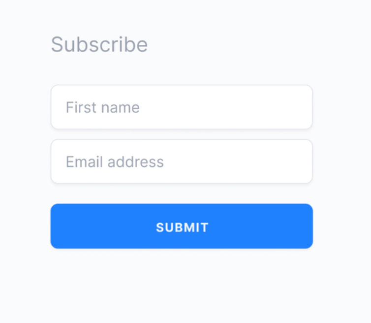
In the workshop, learners are presented with a screenshot of a form and asked to identify potential issues.
Here’s the Subscribe form from the challenge in question:

Here’s the explanation that was included as part of the original solution:
Even though the contrast ratio for the blue submit button fails to meet 4.5:1, it actually does pass WCAG for non-text contrast (at least 3:1). Keep in mind there is a different success criterion for user interface components and graphical objects than static text.
I received an emailed question prompted by this challenge:
While the word “subscribe” doesn’t pass AA as large or regular text, the solution says that text must meet 4.5:1, but I think without knowing the text size, we wouldn’t know if it should meet 3:1 or 4.5:1 (it looks like that text might be big enough to be “large”). I was also wondering if it’s true that text on a button doesn’t have to meet the 4.5:1 standard just because the button is a UI element? Or am I just misreading?
The person who sent me the email is right about font size being a factor in the “Subscribe” heading text and contrast ratios:
If the text is 18pt / 24 px or larger, it will count as “large-scale text” and only need to meet 3:1. Because our example comes from a design asset, we can’t exactly check the font size and verify. But we can provide advice to our design team about contrast requirements: for headings to pass 3:1, they need to be at least 24 px (or 19px bold, rounding up from 18.666px / 14pt). Since this heading has a ratio of 2.3:1, it doesn’t pass either 3:1 or 4.5:1.
For the submit button, it is indeed a user interface component. But the background color only needs to meet 3:1. As you pointed out, the text does need to meet 4.5:1 if the font size is less than 24px (18pt) or 19px bold. The font size wasn’t specified in this case either, so it was a bit ambiguous.
I’ll admit this is a case where WCAG can be confusing–at least it was for me. The Non-Text Contrast criterion (1.4.11) does mention leveraging the rationale for “large-text contrast” in Contrast minimum (1.4.3), which has the 3:1 ratio. But it wasn’t immediately clear that text inside of a user interface component would fall under the different success criterion. I suppose the answer should be obvious from the name: “non-text” applies to backgrounds, icons, and graphics. Text inside components has the other, previously established requirement that factors in font size and bolding. (But then there are also icon fonts, to make things more confusing.)
My original rationale was that the blue submit button is a single control, sitting on its own line with padding and a background color. Similar to headings, I reasoned that these components would stand out at a 3:1 ratio for all of their parts. However, a contrast ratio of 4.5:1 for the text inside of a button component would be more visible to people with low vision or an issue with color perception. It is also a requirement according to WCAG for smaller font sizes.
I think we can agree that the original contrast failed ratio requirements, regardless of how it gets updated. When coming up with a solution, it can help to talk through interpretations of WCAG as a team to make sure you have it right, as it’s easy to get mixed up.
WCAG is also a starting point when it comes to accessibility. Getting feedback from people with disabilities on design systems and pattern libraries with UI components is another great approach, as it’s typically an earlier part of the software development lifecycle.
I appreciate receiving questions like these, as well as the nudges to clarify further!
It’s always good to double-check and make sure things are accurate and we’re all on the same page.